- Critical studies in art and design education
- Essays and dissertations
- Journal of art design education volume 12 number 1 1993
- Reading images The grammar of visual design
- value of visual exploration understanding cultural activities with young people
- Issues in art and design teaching
- Playing and reality
- Play a polyphony of research theories and issues play and culture studies Volume 12
- Toys play and child development
- Towards an inclusive arts education
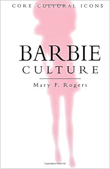
- Just my type a book about fonts
Monday, 26 October 2015
OUGD601 - List of books
I've looked at various books that are useful for my dissertation research
Monday, 11 May 2015


Tuesday, 9 December 2014
CoP2- Essay Question & Research
I have decided using the following essay question


Also I will use the internet to search recent news articles related to the question topic.
To what
extent does the advertising and media industry have an impact on female body
image?
I have chosen this as I have a big interest in the advertising and media industry as well as body image.
I am using the following books for research and reference -


Also I will use the internet to search recent news articles related to the question topic.
Sunday, 23 November 2014
CoP2- Essay Questions
What is the general theme?
Editorial, Printmaking, Typography
What are the current/contextual/historical issues of the general theme?
What do i want to know or be able to do in regards to this theme? Form this into a question that implies a conclusion...
How does this relate to my increasing specialised practice?
General Theme: Advertising
What are the current/contextual/historical issues of the general theme?
Sexism
Misleading
Double Standards
Materialistic Products
Glamorizing
What do i want to know or be able to do in regards to this theme? Form this into a question that implies a conclusion...
Editorial, Printmaking, Typography
What are the current/contextual/historical issues of the general theme?
- Mind map
- Themes
What do i want to know or be able to do in regards to this theme? Form this into a question that implies a conclusion...
- What?
- How?
- To what extent?
How does this relate to my increasing specialised practice?
General Theme: Advertising
What are the current/contextual/historical issues of the general theme?
Sexism
Misleading
Double Standards
Materialistic Products
Glamorizing
What do i want to know or be able to do in regards to this theme? Form this into a question that implies a conclusion...
- History of specific advertising
- This idea of sexism within advertising, How women are portrayed within the media and through magazines such as Vogue
- How one thing can be done by one person and not by the other
Cop2 - Essay Question Research
For my essay question I knew I wanted to go down the route of advertising as this is what I'm interested in, I also knew I wanted to challenge stereotypes within advertising for example gender roles, sexism etc...
Before jumping ahead of myself I need to establish my question before going straight into the practical element of CoP2.
I started to research into women stereotypes looking at this idea of how women are degraded to sell products within advertising.

This past advertisement with the caption 'You mean a women can open it?' is very degrading as it's basically saying women are weak and they wouldn't be able to open a bottle of ketchup... which isn't true.

Lynx as many people know is a product for men selling toiletries. Quite a recent advertisement this is very degrading showing the women dressed in a swimming costume with the caption 'the cleaner you are, the dirtier you get'. In my eyes this is degrading to women as it is not only sexualising females but it also uses them as a product.

I guess the use of headlamps is also referring to the woman's breasts within the advertisement, also there is no need to use the breasts within the advertisement as the advert is about a car trader, the breasts are there to attract attention.
Before jumping ahead of myself I need to establish my question before going straight into the practical element of CoP2.
I started to research into women stereotypes looking at this idea of how women are degraded to sell products within advertising.

This past advertisement with the caption 'You mean a women can open it?' is very degrading as it's basically saying women are weak and they wouldn't be able to open a bottle of ketchup... which isn't true.

Lynx as many people know is a product for men selling toiletries. Quite a recent advertisement this is very degrading showing the women dressed in a swimming costume with the caption 'the cleaner you are, the dirtier you get'. In my eyes this is degrading to women as it is not only sexualising females but it also uses them as a product.
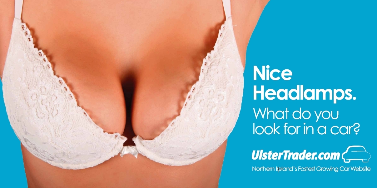
I guess the use of headlamps is also referring to the woman's breasts within the advertisement, also there is no need to use the breasts within the advertisement as the advert is about a car trader, the breasts are there to attract attention.
Wednesday, 7 May 2014
CoP- A Visual Response- Making
For the making of the magazine I knew I wanted it to be printed high quality and in glossy stock. I booked myself a digital print slot as I knew it would fill up and I didn't want to be left without anything to hand in.
I decided I wanted glossy stock as this is what magazines such as Vogue look like. Also I wanted this perfect high quality magazine as when looking at beauty ads etc this is what you see.
I asked a friend to model different Vogue covers for me and she took these on a mobile phone camera. This didn't really matter as what I wanted to show this idea of natural beauty.
I used a typeface that was similar to the Vogue typeface. This was called Dubiel and is a serif font which is quite typical of high fashion magazines. I also used times new roman for the body copy.
The colour scheme was basic with the only colour being from the photographs. I then used black and white as I felt this was very classy and would make it look high quality rather than using a mass of colours which in my opinion would make it look messy and less high quality.
I used quite a lot of quotes in my book as I wanted to get this point of natural beauty across instead of this idea of photoshopping models in which people aspire to.
My magazine is called Natural as this was the point of my idea. I want to show people that there is nothing wrong with being natural and people shouldnt be aspiring to look like these models which don't even look like that themselves.
The front page of my magazine is printed on high quality thick gloss stock and the pages are a matte stock which still is high quality. To bind the book together I stapled it as this is typical to most magazines and I felt this was most appropriate for the magazine.


Subscribe to:
Posts (Atom)
